reach · Career & Personal Branding
What makes a personal website look expensive
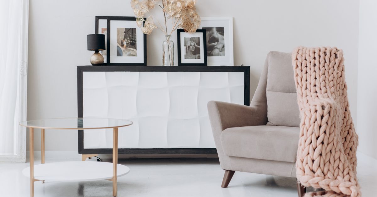
The difference between a page that looks premium and one that looks like a free template is rarely money — it’s taste and restraint. And the cues that read as “expensive” are surprisingly learnable.
The cues that read as premium
- Restraint. One or two fonts, one accent colour, lots of space. Cheap sites shout; expensive ones breathe.
- Sharp typography. Considered type at generous sizes does most of the heavy lifting.
- Real hierarchy. One clear message per screen, not everything competing at once.
- Editorial writing. Confident, specific copy — not filler — signals a real person who knows their value.
- Consistency. Aligned spacing and a coherent look throughout read as “designed,” not assembled.
How to get it without a designer
You don’t need to learn design to apply these — you need a starting point that already respects them. reach builds pages on exactly these principles by default: restrained, editorial, positioned, with typography and spacing handled for you. Upload your CV, pick a look, and you get a page that looks considered from the first draft — free to publish, live in minutes.
Skip the template look entirely.
Frequently asked questions
What makes a website look expensive?
Restraint (few fonts, one accent, lots of space), sharp typography, clear hierarchy, editorial writing, and consistency. It’s taste and discipline, not budget — cheap-looking sites usually try to do too much at once.
Can a free website look high-end?
Yes — the cues that read as premium are design choices, not paid features. A builder that respects restraint and typography by default gives you a considered look for free.
How do I get a premium look without design skills?
Use a builder that positions and designs by default. reach builds editorial, restrained pages from your CV — no code, free to publish, live in minutes.